
Concept & Branding
From a fisherman’s
family to your table
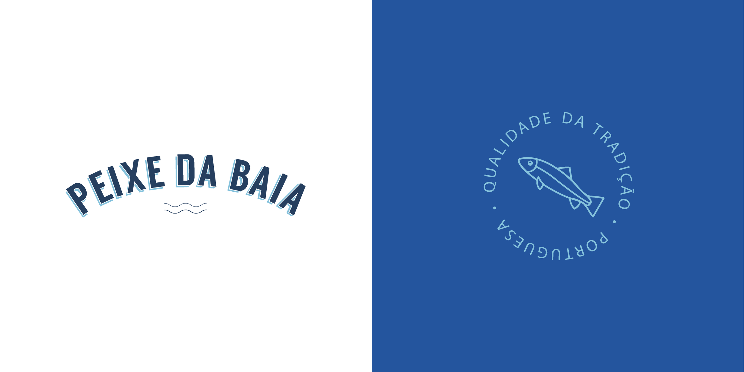
We focused the brand on maritime characteristics, using as inspiration typical fonts on fishing boat names. The font we choose captures these characteristics but also gives the brand a modern look. The colors and graphics of the brand are inspired in the Mediterranean Sea and its culture.

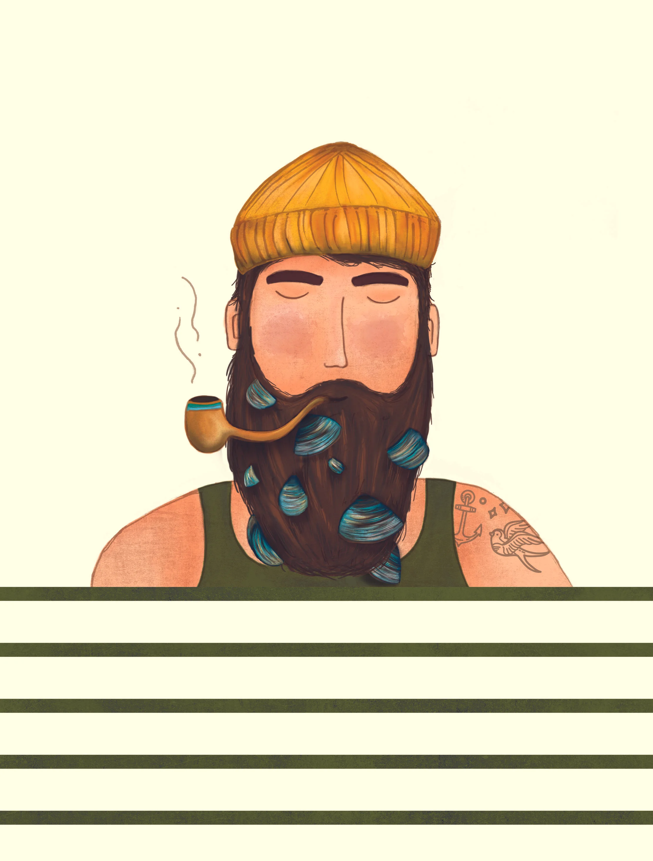
Illustration
As tribute to the fisherman we decided to show each product with an illustration of a character interacting with the product to be sold. The illustrations were made by hand and digitally enhanced creating a modern feel making it more attractive than typical food preserves in the stores.


Packaging Design
The graphics and color coding for the packaging transmit freshness making it easy for the consumer to recognize the attributes of the products in the shelves. The style is also key making it easy for the brand to create their space in the consumers mind.
